Overview
Figma, Miro, Canva, Zoom
Challenge
Role
Time
Tools
This UX case study explores how to redesign the hotel booking flow based on usability testing and user research. The goal was to identify pain points in the booking journey and create a simplified, more transparent user flow that improves discovery, clarifies options, and streamlines checkout.
User testing revealed recurring frustrations across multiple booking sites:
🏖️ Difficulty finding hotels near desired locations
🍳 Unclear if breakfast was included in the price
🔁 Confusion around refundable or changeable rooms
💳 Checkout pages lacking a clear summary
🛏️ Room features and add-ons not visible enough
➡️ These insights highlighted the need for a clearer, more intuitive booking journey.
UX designer (solo): Notetaker, Moderator, Workshop facilitator, Information Architecture, Webdesign, with peer support for tests and card sorting
Sector
Hospitality – Hotel booking flow
12-month UX Design Institute program
Project:
Simplifying Hotel Booking Website
Prototyping &
Handoff
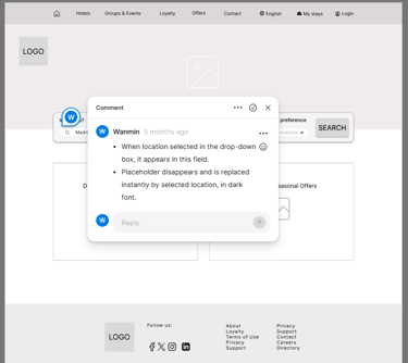
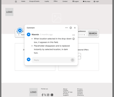
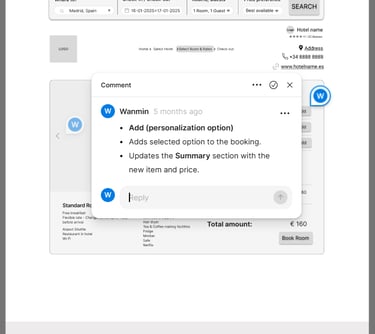
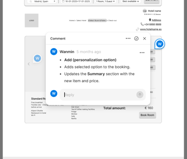
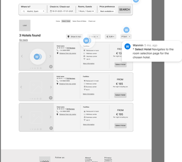
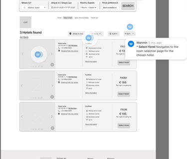
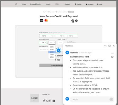
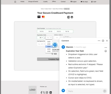
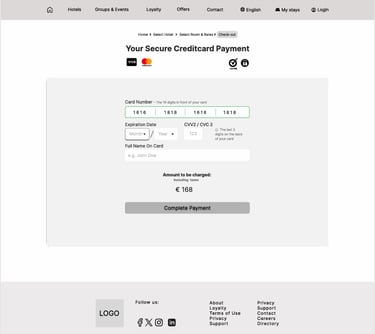
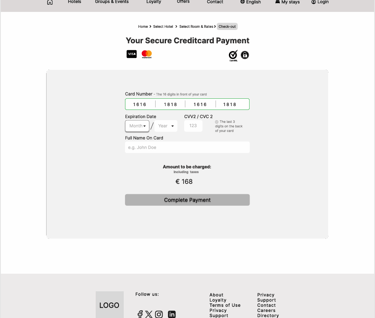
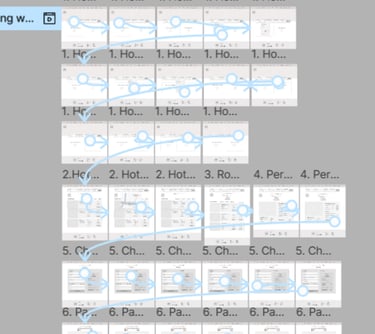
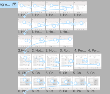
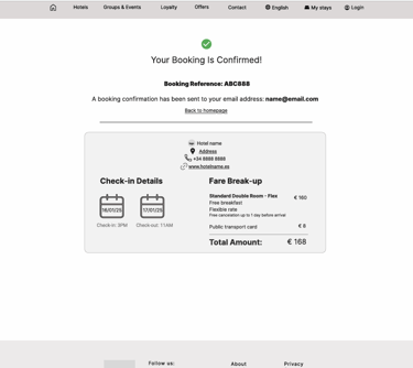
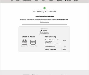
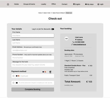
In Figma, I created a mid-fidelity prototype of the redesigned booking flow, simplifying search, pricing clarity, and checkout. The prototype follows the main ‘happy path’: booking a double room in Barcelona (16–17 January) with clear details on location, facilities, breakfast, and cancellation. Only the primary path is clickable.
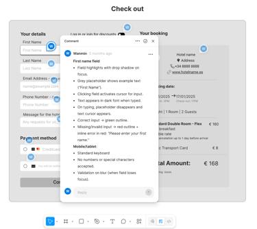
For handoff, I structured flows with consistent layouts and annotations so developers could easily interpret functionality. While this project ended at mid-fidelity, it strengthened my ability to design with both users and implementation in mind, bridging research insights into practical, buildable solutions.
Methods:
Interactive Prototype – Created mid-fidelity screens to simulate the new booking flow.
Micro-interactions – Refined transitions and feedback for a realistic experience.
Developer Handoff – Organized design specs and assets for smooth implementation.
Outcome:
Delivered a clickable, developer-ready prototype ready for usability testing and build.
Usability Testing → Testing the new booking flow with users